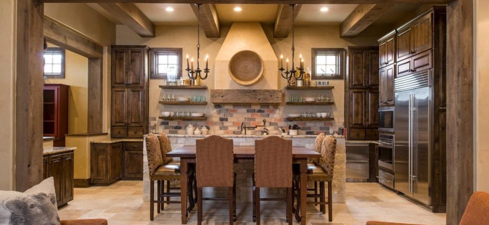
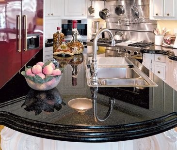
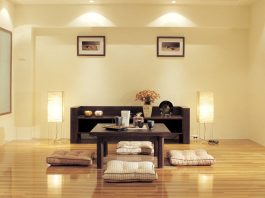
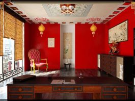
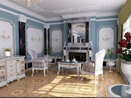
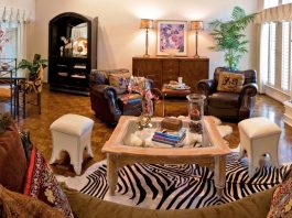
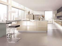
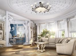
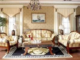
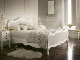
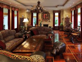
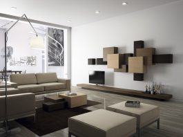
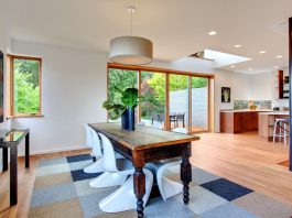
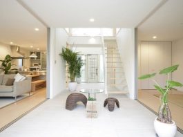
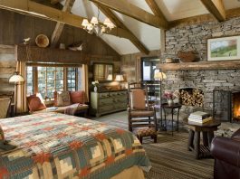
Country kitchen style: the warmth of natural materials
“Natural”, “Village”, warm and home-like, there are many epithets to describe the country style in the interior...
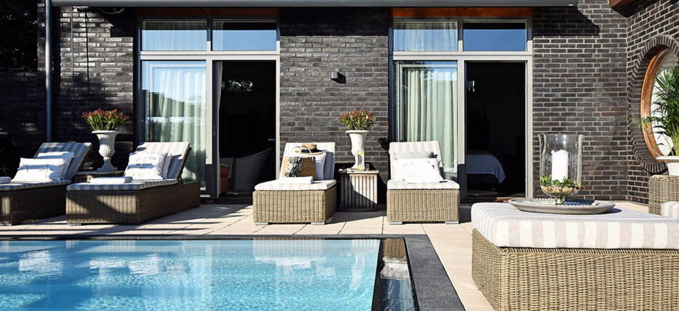
Dream house for sale with luxury pool and river life hidden in the courtyard
Behind the wall of the house is a 300 square meter large - fully insured and private pool paradise. The heart of the house offers everything that makes the...
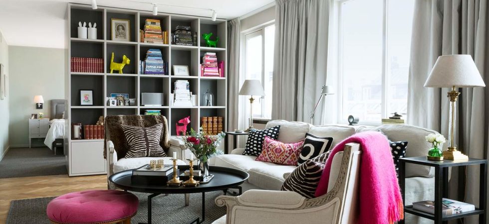
Elegant attic with stunning light emitting dirt and fine storage
Lots of smart storage and stylish space-based solutions characterize this elegant loft. Caring for details, fine proportions and consistent thinking about color and material creates a thoughtful overall.
At the...
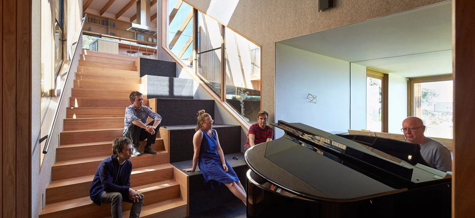
Split House: The Architecture Masterpiece From BKK Architects
Split House is a wonderful architectural pattern. This cottage is spread out over the waste ground like sharp-edged fragments of some unseen fruit. Certain volumes open unbelievable views on...
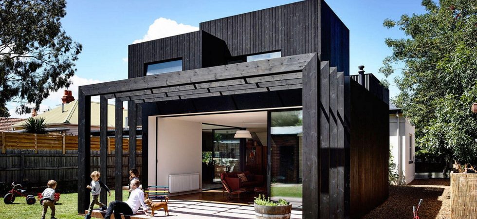
Contemporary House: Renovation Of The ХІХ-Century House By Ola Studio, Australia
This modern house in Melbourne, Australia, had been initially built in XIX-century and was renovated in 2015. Initially this house was constructed in the Victorian style and today it...
The House With A Mansard By Post Architecture Studio, Australia
This house is basically a three-level cottage located in Perth, Australia. It was performed in modern style and finished in 2016.
The building stands in line with houses of the...
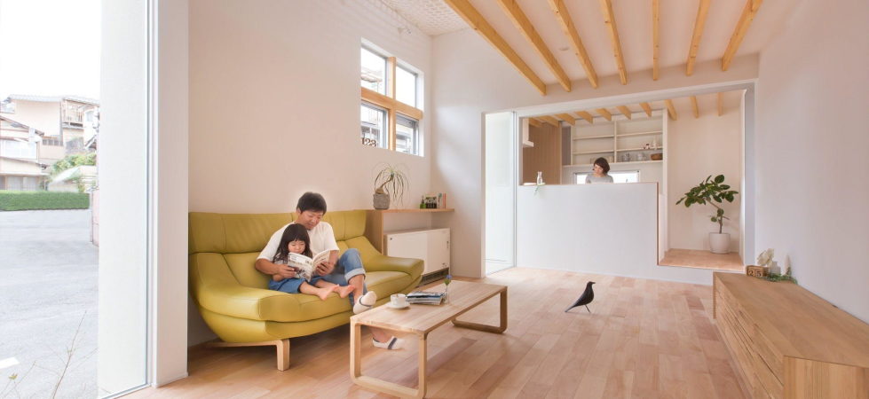
The House In Japanese Minimalism In Kyoto By ALTS Design Office
The project of 2016 by ALTS Design Office in Yamashina ward (Mukō city, Kyoto Prefecture, Japan) is a perfect example of Japanese Minimalism. The house is constructed on a...
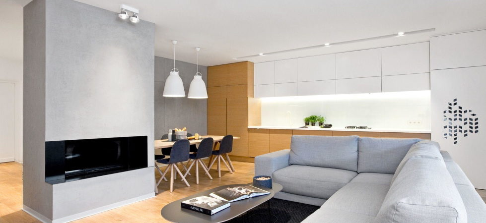
The “Perforated House” In Poland By Spacelab
This one-floor villa of the 80-s had been gradually dilapidated and was first-ever renovated only in 2015. The Spacelab company from Poznan made some corrections of the room`s planning...
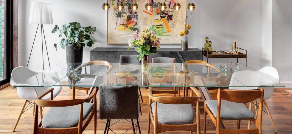
Tlv Gordon 8.2: The Apartment In Tel Aviv
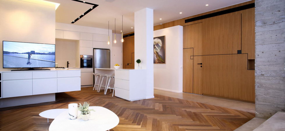
This is a private apartment in Tel Aviv, Israel, decorated by Dori.Interior.Design studio. The spacious flat consists of an open-style living room, conjoined with a kitchen and a dining...
Villa Zeus: The Townhouse In Sunny California
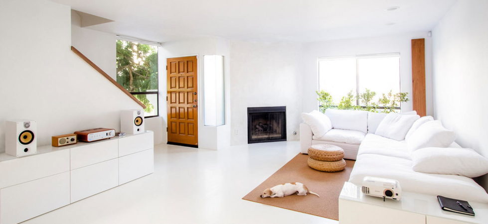
The Kiduck Kim Architect bureau has transformed an old townhouse, constructed as far as 1983 and located in Los Angeles, California, the USA. The project is called Villa Zeus,...
The Apartment Of 47,5 Square Meters In Kyiv
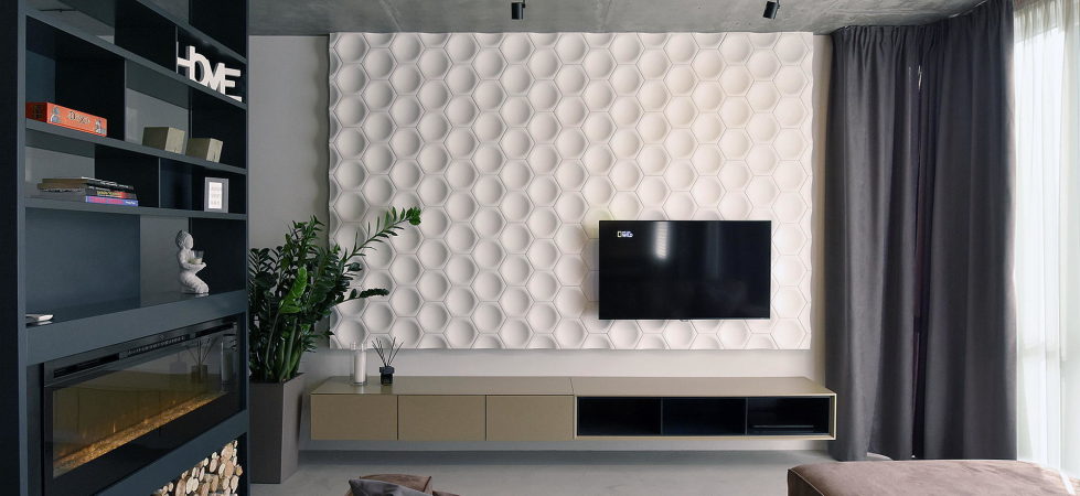
Oleg Kujava, the architect, has introduced the project of an apartment interior of 47,5 sq meters in Kyiv.
The main emphasis was made on functionality. The architect managed to compactly...
Living room wall units by Ronda Design Lab
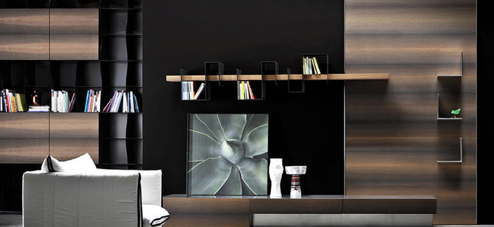
Ronda Design produces an array of different wall-mounted systems to organise and best exploit your living room space. A host of solutions designed to sort out and store your...
Chelsea: The Designers Loft At Manhattan
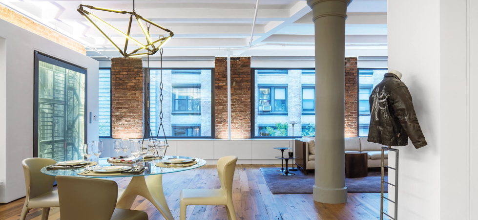
Chelsea apartment in New York is the result of joint work of Alexander Gorlin Architects and Larsen Design studios. This residence occupies 250 sq meters and used to be...
Reconstruction of The Old House in Berlin by asdfg Architekten
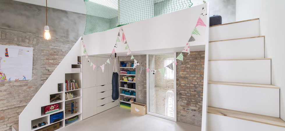
The project of asdfg Architekten studio was put in life in Berlin (Germany) in 2015. Designers have managed to turn an old building of 400 sq. meters into a...
The Loft Overlooking Taipei
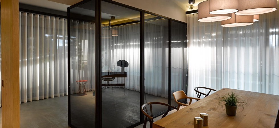
This loft is located close to a river and opposite a small park in Taipei (Taiwan). It was designed by Create + Think Design Studio. The general plan of...


